
| |
So what should I say? Welcome to the new Cricinfo? But that will be a misrepresentation. In most ways it is still the site we have all known, and as many of you have pointed out in response to my earlier piece, why do we need a new Cricinfo? Let me repeat a word that I used in the other piece: this is Cricinfo renewed. It's a step, a significant one, forward.
Change is often unsettling. We trust the old ways because there is evidence that they work, and there is no evidence yet that the new ones will. We are already feeling wistful about the old site, so we know how some of you feel. As Nietzsche said, love is more afraid of change than destruction. But to that, let's add this one from the Buddha: Everything changes; without change, nothing remains.
Change for the sake of change is indulgence, but mostly, it is the only thing inevitable in life. Finally, success and failure, happiness and misery, come down to how we manage change. We derive our confidence about this redesign from one central truth: our singular focus throughout this process has been to enhance your experience of the site.
Take a look the . The most important thing about it is that it is a celebration of content. There is more of it, and it is organised better. Earlier, we had all our editorial content stacked up in a single central panel. The structure gave us no other options. As we kept adding new features and sections, they kept piling up, the page grew longer, and there came a point when we could add no more.
The starting point of this redesign was the navigation. In some ways, the left-hand navigation bar was easy for us to manage: we could do pretty much anything with it. All we had to do was to add a new item to the menu whenever we needed to. But it was sub-optimal from the usability point of view; you needed to scroll to see it in its entirety. And, equally importantly, it ate up vital homepage space. By moving it to the top, we have achieved two of our prime objectives. We have given you a cleaner, more logical and intuitive navigation. And we have freed up space to showcase content.
On the face of it, the navigation is smaller. But it packs in much more. The hierarchical design contains a second, and sometimes a third, level that takes you deeper into the site with a single click. For regular users who have their preferred sections, it's a great tool. For example, if you like the , point your mouse at Features, go down to The Short Stuff, and then click on My Favourite Cricket story.
To help further, we have added a Quick Links strip, just below the navigation, to highlight the major current events in cricket.
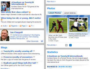
Below it, the content is organised in a richer yet simpler fashion. The big stories of the day take centre stage, in a distinctive panel that also houses the video player. Concerns that the video player might slow the site down are unfounded, because the video starts playing only when you click on the relevant tab. The space vacated by the navigation is taken up by a wider lead photograph, which enhances the visual appeal of the page.
The other news headlines are directly below the main stories, and there are now more of those: nine as opposed to four. At the bottom of the news panel, we have links to In Focus, a section that aggregates content on a topical big issue. On the menu today is the row over the hosting of the.
All our features content - and - are now showcased together in the Specials panel, with little icons next to the headlines marking out the sections. The panel is split in the middle by three of the daily favourites: and .
Our writers give Cricinfo a distinct voice and there a small panel below Specials to give you direct access to them. The blogs bring up the base in this column.
The new homepage is also an opportunity to give prominent positions to some of our most visited sections: statistics and photographs. We now have a where you will find all the records, columns and blogs (The Numbers Game, Ask Steven, The List, It Figures) and features relating to statistics, in addition to graphs and helpful links from Statsguru, a cult in its own. You can to be featured here as well.
But the most important, and for me the most exciting feature, of the homepage is the scorecard module. Live match coverage is the soul of Cricinfo and the small scores module in the top right corner had never quite felt right. Now it has been given its rightful place in the wider format. But more than the size, it's the way the scores module works that hooks me.
To start with, you can now see the live scores, and match situations, upfront. Scorecards are neatly organised by category: you will always find live matches involving international teams on top. The domestic tournaments are grouped together by country, and a collapse-expand option allows you to access as much or as little information as you like. Results and Fixtures are now part of this panel and thus accessible directly from the homepage.
Of course, the redesign doesn't stop at the homepage.
| ||
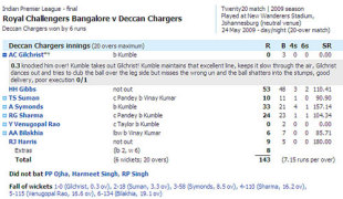
The scorecard page remains light, but it is significantly enhanced. It's cleaner, aesthetically more pleasant, and most of all, it incorporates everything else you might want to read about the match: reports, comments, news, quotes, all organised by the day. You can even see the match photographs on this page the moment they are uploaded. And for the coolest feature, click on the next to the batsman's name.
The fixtures and result pages are more user-friendly. You can now filter them by country, competition, and game format. And don't miss the weather forecasts that are now part of the page (and the scorecards). All sections now have a local search and the story pages now have contextual links with the text area. I could go on and on, but it is perhaps best that you explored the site yourself.
Of course, a lot more is still to be done. The blogs are still in the old template. A more powerful search is being built. And your comments will find a more prominent place on the site. And though we have tried our best to eliminate all the major bugs, it is likely that you will encounter a few glitches, and we hope you will .
Some of you who happen to be rugby fans may have noticed a similarity to scrum.com, and that's because our sister site, which was relaunched in 2008, adopted some of the early design ideas. Cricinfo is a much larger site, and we have refined and sharpened those ideas further.
It's a huge day in the life of Cricinfo. We have seen this taking shape over the months, page by page, section by section. There is joy and relief that it has now sprung to life. There is a sense of fulfillment too, and it's a privilege to share it with you.
In the end it's about you. Your passion and faith runs Cricinfo. What we have tried to do through this exercise is to be worthy of it. Cricinfo has evolved, but the soul of the site remain intact. Some things must never change.
Mostly a triumph
The redesigned Cricinfo has attracted masses feedback: much of it positive, some disapproving, and a few outright angry. We asked some of our peers what they thought
June 4, 2009

| ||
Tim de Lisle, former editor of wisden.com and editor of The Intelligent Life
I thought the redesign was largely excellent - not just fresh but more open, more inviting, more navigable and less claustrophobic. It feels more like a major sports site and less like a nerds' convention, and yet the nerdy bits - the scores on the doors, the stats homepage - are very well done so you've pulled off the trick of keeping both camps happy.
For me there are two jarring notes, both easily fixed. The Cricinfo logo doesn't stand out as strongly as it did - the red of ESPN argues with it, and there's clutter round about - sometimes the ad swamps the logo altogether. I'd give it a nice bit of white space and let it sing out. The other thing is the black box on the homepage. The black is forceful, but the yellow out of black feels wrong - like a different site. Blue is such a signature colour for you, I would change those yellow slugs to pale blue. But mostly it's a triumph. You've clearly thought the thing through and executed it very well. Congratulations to the whole team.
Mukul Kesavan, novelist, essayist and historian
The redesign is a huge improvement. Transformation would be a better word. This is a very good-looking site, where it is easy to find your way around. I feel no nostalgia for the old Cricinfo homepage, which was cramped and which, especially on the right-hand side, looked like an anthology of bad Indian signage.
The row of links on top of the new page with its dropdown menus works very well. The older site was a bit like maze that you had to learn your way around: here the tabs signal the different sorts of content clearly. (I'm not sure why there are separate tabs for "Fixtures" and "Series"; in the interest of consistency the latter should be part of the former's dropdown menu.)
The large box for for current scorecards is a delight. The commentary is much clearer in two colours, and the revamped scorecards with their clickable descriptions of how wickets fell tell me nearly everything I need to know about a match at a glance.
I'm not sure that the static photograph in the black news box is the best use of prime space. If the homepage can't open by default on the video tab because of loading times, then the still photograph ought to be, I think, part of a slideshow, where the image keeps changing. For the past hour or so, the photograph has been one of the New Zealanders celebrating at the fall of an Indian wicket. This seems a bit newspaper-like: perhaps it could change every five minutes or so, so that the site feels refreshed, and to use a bad word, kinetic.
I speak as someone on the wrong side of 50 who finds small print a strain: the default font size on the site makes me squint a bit. I can magnify it, but that messes up the formatting, especially with the scorecards.
The blog formats were dull and unadventurous to begin with; now, with the redesign, they look like sludge. If bandwidth isn't a crippling restraint, it would be a huge improvement to have embedded youtube videos and bigger photographs in the blogs.
On the whole, though, this is a wonderfully successful revamping of the site, one that I had long hoped for but more or less given up on. Congratulations.
| "I was a bit unsettled by the new look at first. However, having had the opportunity to navigate the site properly, I have almost forgotten what the old one looked like!"Simon Borchardt, editor, SA Cricket Magazine | |||
Mike Coward, Australian cricket writer
It does arrest attention. It's easy and accessible and quite seductive when it comes up. I love the scoreboard presentation too.
Simon Borchardt, Editor, SA Cricket Monthly
As you say, change can be unsettling, and I was a bit unsettled by the new look at first. However, having had the opportunity to navigate the site properly, I have almost forgotten what the old one looked like!
I like the way the live scores of all matches are on the right-hand side (so you can see what's happening at a glance without having to open any links). I also like the way you now have a headshot of the columnists (I've always wondered what they look like) and how you use a quote from the article to draw readers in.
The scorecards do look better than they did before, and I like the "+" next to the batsman's name that lets you see how he got out. I also like that there are far more news stories visible in the news section (often in the past, still relevant stories would drop off the list because there was just so much news on that day).
At first I didn't like the black news block, but now I barely notice it and I think it's one of those things that grows on you.
Imran Khan, cricket communications manager
The black patch is, to my mind, wholly unwise and frankly disastrous. It is unattractive, ghastly, and deadens the site - as opposed to adding drama. I understand the desire for drama, but I perceive it to be a failing of many a news-oriented website. The drama ought not be in the site design and layout, but in the content as offered by the sport in question. Perhaps "it just ain't cricket" applies best here. Particularly at this juncture in world cricket, Cricinfo need not feel the need to sex up the sport through website design - cricket is doing a pretty good job of that all by itself.
Cricinfo, for me, is loved because it gives me what I need in a simple relatively easy-to-use manner. I log on and the business of cricket reportage, stats etc. is what is available and what is the focus, not the sexing up of the news through design and sensationalism. Now Cricinfo has removed itself from that by feeling the need to sex up. Cricinfo is departing from its position of the cricket website of record.
Scyld Berry, editor Wisden Cricketers' Almanack
I can accept any changes as long as the writing is dark on a light background, not light on a dark background. Maybe I'm alone, but I find that really putting-off on the main page, as it is much harder to read. That's far and away my initial reaction. The rest of the changes I'm sure will be fine.
Peter Lalor, cricket correspondent for the Australian
It's very bright. It was a bit of a shock at first, but then I got comfortable with it. I always found the old site easy to navigate.
No comments:
Post a Comment